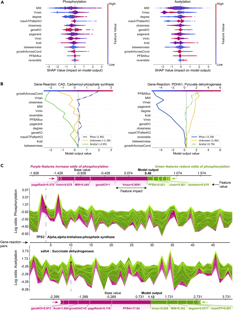
Figure 5.
Interpretation of the CAROM-ML model using Shapley analysis
(A) SHAP summary plot for the phosphorylation class (left) and acetylation class (right). The summary plot shows how a feature's effect on the output changes with its own value. For each feature, high values are shown in red and low values in blue. For example, it appears that Vmax is positively and negatively correlated with the log odds of phosphorylation and acetylation, respectively. Features are ordered on the y axis by their average SHAP importance value across the three classes.
(B) SHAP decision plots for a phosphorylated enzyme (left) and acetylated enzyme (right) show how the model's prediction was made for a single observation. Each line represents the log odds for a single class. The features are on the y axis and are sorted by the average SHAP value for that specific observation. The lines intercept the top x axis at their final log odds value. The class with the maximum log odds value is used as the model's output.
(C) SHAP force plots show the features which significantly pushed the model output from its expected value to its final prediction. Features that push the prediction higher for the respective class are shown in purple and features that pushed it lower are shown in green. Single force plots for a phosphorylated reaction (top; TPS3) and an acetylated reaction (bottom; sdhA) are shown. The collective force plots are made up of many single force plots rotated 90° and stacked together horizontally and are shown for phosphorylation (upper middle) and acetylation (bottom middle) for the same 50 random observations. The model output, f(x), is on the y axis and observations on the x axis. The dashed lines show where the single force plot observations appear in the collective force plot. For both the single and collective force plots, the model output is read where the purple and green areas intersect.

