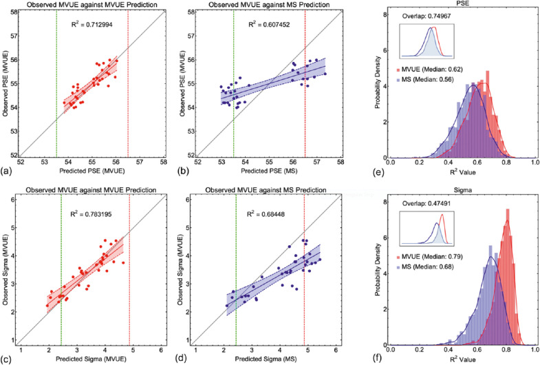
Figure 8.
(a) through (d) show an example linear regression analysis where the data from 36 observers behaving in accordance with MVUE (with 55 samples per stimulus value and a delta of 3 mm) are plotted against the predictions of the two candidate models (MVUE a and c, and MS b and d), for both PSE a and b and Sigma c and d. The least squares first order polynomial is shown as the solid line, with the dashed lines and shaded region showing the 95% confidence bounds around the fit. In a and b the dashed red line shows the true underlying PSE for cue A, and the green dashed line shows the true underlying PSE for cue B. In c and d the red dashed line shows the (fixed) sigma for cue A, and the dashed green line the minimum possible sigma for cue B (which varied across simulated observers). (e) and (f) show the full distributions for the R2 value across all 1000 simulated experiments for e PSE and f sigma. Data are shown as bar histograms and as smoothed histograms (smoothed Gaussian kernel distribution; Equation 9). Red data are from MVUE observers plotted against the predictions of MVUE; blue data are from MVUE observers plotted against the predictions of MS. The median for each data set is shown in the graphs. The inset graph shows the overlap of the smoothed histograms (Equation 10). Note that the axes of the inset graphs are smaller to ensure clarity of the overlapping region.

