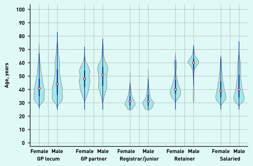
Figure 2b.
Age distribution of GPs in December 2019 by type and sex. a
a The thick blue line represents the interquartile range (IQR) and the thin line represents the rest of the distribution with upper/lower adjacent values. The red dot represents the median of the data. The distribution shape of the data is based on a kernel density estimation where wider sections of the plot represent a higher chance that members of the population of interest will take on a given value and where the thinner sections represent lower chance.

