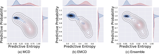
Figure 5.
Contour plots of predicted probabilities and uncertainty estimates (entropy) for three uncertainty quantification methods. Distribution of estimated predictive uncertainty estimates grouped by correctly classified and misclassified are shown on the top of plots. The best separation between two groups is obtained by ensemble methods. The red lines (contours) are related to miss-classified predictions with high uncertainty and the blue ones are for correct-classified predictions with low uncertainty.

