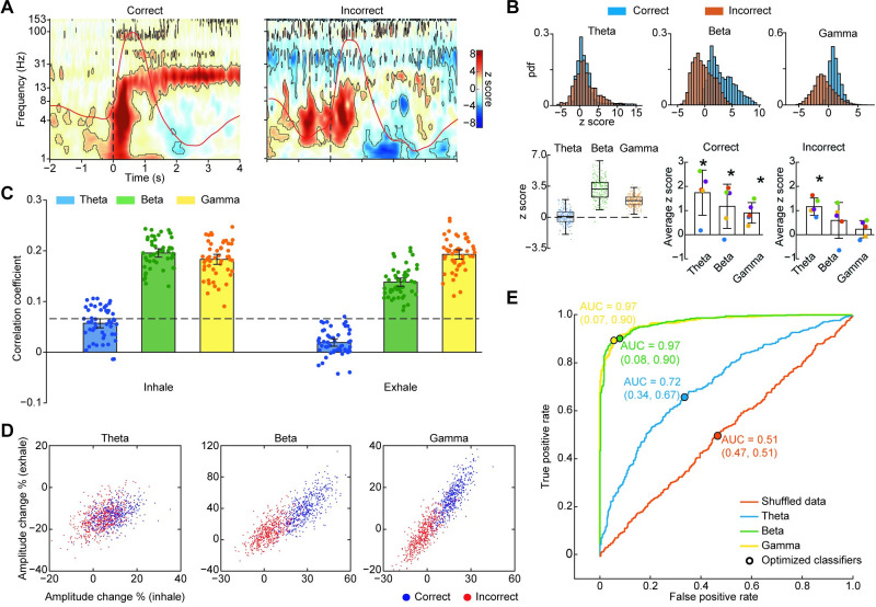
Fig 4. Beta and gamma oscillations predict odor identification accuracy.
(A) Z-normalized spectrograms for correct (left) and incorrect (right) trials separately. Averaged respiratory signals are overlayed on each spectrogram (red lines). Dashed lines represent sniff onset. Black contours indicate statistical significance of permutation test against pre-cue baseline (P < 0.05, FDR corrected). (B) Amplitudes within each frequency band, for correct and incorrect trials separately. The upper panels show the distribution of z score amplitude values for each trial for the theta, beta, and gamma bands, for correct (blue) and incorrect (red) trials. The lower left panel shows box plots for the bootstrapped distributions of the difference between correct and incorrect trials. Boxes represent the 25th to 75th percentile of each distribution, the central marker indicates median, and whiskers extend to the extremes of the data excluding outliers. Colored dots represent raw difference values for each distribution. The lower right panels show individual participants’ mean response amplitudes in the theta, beta, and gamma bands, for correct and incorrect trials separately. Each dot represents data from a single participant, bars indicate the mean across participants, and error bars are standard error across participants. Stars indicate statistical significance (two-tailed one-sample t test; P < 0.05). See Fig 2B for the color code of single participant dots. (C) Bar plots of bootstrapped Pearson’s correlation coefficients computed between oscillatory amplitudes and task accuracy for each frequency band, over the inhale and exhale time periods separately. Error bars indicate 95% confidence interval of the mean. Dashed line indicates FDR threshold for significant r value. Dots represent single correlation coefficient calculated from each bootstrap. (D) Scatter plots show bootstrapped percent change relative to baseline for correct and incorrect trials, during inhale and exhale time periods for each frequency band. Each dot is the average result from 1 bootstrap repetition. (E) ROC curves of linear binary SVM classifier applied to each of the scatter plots in panel C. Black dots represent optimized classifier; AUC is indicated for each ROC curve. The source data for panels (A–E) are available in S3 Data. AUC, area under the curve; FDR, false discovery rate; ROC, receiver operating characteristic; SVM, support vector machine.

