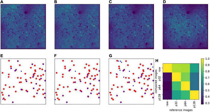
FIGURE 4.
Effect of patch size. Upper panels show the same example slice (in layers II/III) with different patch sizes for vignetting correction: (A) Patch size 32×32 pixels (denoted as p32); (B) 64×64 pixels (p64); (C) 128×128 pixels (p128); and (D) raw images without vignetting correction. In (E–G), the blue dots show the projections of all highly active cells (δXl is larger than the mean value plus three times the standard deviation) in layers II/III on the x-y plane, calculated based on p32, p64, and p128, respectively, and the red diamonds represent the highly active cells calculated based on the raw images. (H) Shows the overlap rates (|Hi∩Hj|/|Hi|) of highly active cells between any pair of the aforementioned images, where Hi denotes the set of highly active cells from the reference image, Hj from the image used for comparison, and |⋅| denotes the cardinality of the set.

