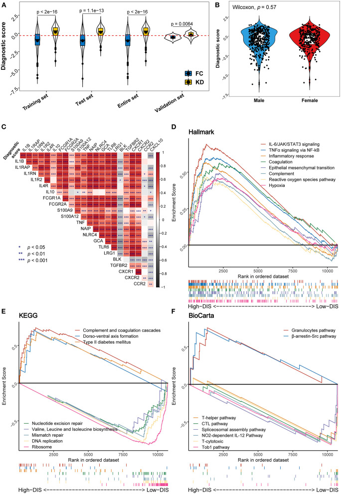
Figure 4.
Distribution of the diagnostic score and biological functional analysis. (A) Distribution of the diagnostic score in the different studied datasets. In each set, the box plot inside the violin plot represents the median value and the interquartile range of the diagnostic score, and the black point indicates the mean value. The horizontal dashed red line represents the cut-off used to discriminate patients as having KD (above the line) or infectious diseases (below the line). (B) Comparison of diagnostic scores between male (blue) and female (red) patients. (C) Correlation heat map between the diagnostic score and the expression levels of genes previously reported to be associated with KD. (D–F) Gene set enrichment analysis (GSEA) displays biological processes and pathways using the gene sets of “h.all.v7.4” (D), “c2.cp.kegg” (E), and “c2.cp.biocarta” (F). In each figure, the top eight results ordered by enrichment score are shown in different colors.

