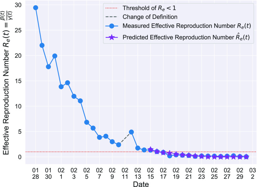
Fig. 3.
Effective reproduction number  of the time-dependent SIR model of the COVID-19 in China. The circle-marked solid curve with blue color is the
  based on the given data from Jan. 27, 2020 to Feb. 20, 2020, the star-marked dashed curve with purple color is the predicted
  based on the data from Jan. 27, 2020 to Feb. 15, 2020, and the dashed line with red color is the percolation threshold 1 for the effective reproduction number.

