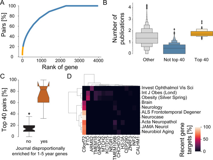
Fig 6. Early-stage research focuses on a handful of genes and is driven by specific domains.
(A) Cumulative distribution of pairs of highlighted genes and 2010 to 2018 publications highlighting recent gene targets (first highlighted 1 to 5 years before). The x-axis ranks genes by number of publications highlighting them, with rank 0 corresponding to the gene highlighted in the most publications. The y-axis tallies the percentage of all pairs of highlighted genes and 2010 to 2018 publications highlighting recent gene targets with a lower or equal rank. We emphasize in orange the top 1% genes (40 genes), which together account for 21% of all pairs. Note that for simplicity of data representation, we allow for overlapping and shifting time windows. For example, a gene that has been first highlighted 5 years prior the start the indicated decade would will only be represented by a single year in our analysis. (B) Letter plot of all highlighted genes reporting for each gene the total number of publications until 2018 for genes that still were a recent target during the time 2010 to 2018 period, but were not (“Not top 40,” blue) or were in the “top 40” (“Top 40,” orange) and “other” genes (gray). Area of boxes indicates share of values, with heights of boxes following letter style dimensions (innermost boxes contain 25 to 75 percentiles of values and subsequent boxes 12.75 to 87.5 percentiles of values, etc.). Note that for 2010 to 2018, “other” is practically synonymous with genes first highlighted before 2005. Note further that some the genes of the “Not top 40” category may still accrue more publications until 2018, the final year of our analysis given the presence of shifting time windows. (C) Journals that enrich for top recent gene targets preferentially highlight top 40 genes. Percentage of pairs of publications and recent gene targets that fall onto the top 40 recently highlighted genes. Journals are considered to disproportionally enrich for recent gene targets if they enrich for recent gene targets at least twice as much as they enrich for novel gene targets (above dashed line in Fig 3C). (D) Different top 40 genes are highlighted in publications from journals dedicated to different fields. The heatmap plot shows the percentage of publications highlighting a given recently highlighted gene from among all publications in the given journal. Shown are journals that highlight recent gene targets and enrich for recent gene targets at least twice as much as they enrich for novel gene targets (above dashed line in Fig 3C). Genes and journals are ordered and grouped using Ward clustering. Combines data from MEDLINE, NCBI gene and taxonomy information, gene2pubmed, and PubTator. For data underlying the figure, see https://doi.org/10.21985/n2-b5bm-3b17.

