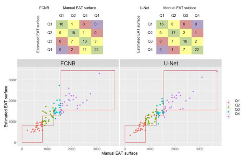
Figure 5.
Quartile classification results from EAT area estimated from networks segmentation against classification from manual EAT area. Only segmentations from preferred systolic frames were shown here. Markers colors were defined by manual EAT quartiles. Red squares delineate manual EAT quartiles.

