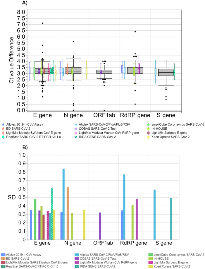
Fig 10.
(A) Ct value difference between both samples per test system and (B) their respective standard deviations (SD). The grey boxes display all results for the respective sample, and the distributions of specific manufacturer-based collectives are illustrated as smaller, colored box plots in overlay with the total results. Outlier were excluded from colored boxes. For all boxes, the whiskers stretch from the 1st quartile—1.5*(interquartile range) to the 3rd quartile + 1.5*(interquartile range).

