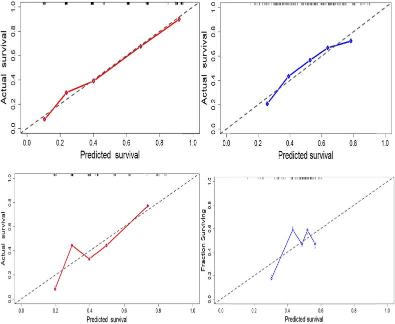
Fig. 3.
Calibration plots for clinscore and radscore, respectively, for the train(top) and test(bottom) data. The predicted survival is plotted on the x-axis, and the actual survival is plotted on the y-axis. The dotted gray line represents an ideal fit where the predicted probabilities perfectly match the observed probabilities. The diamonds show the estimated model performance, and the crosses indicate bias-corrected estimates.

