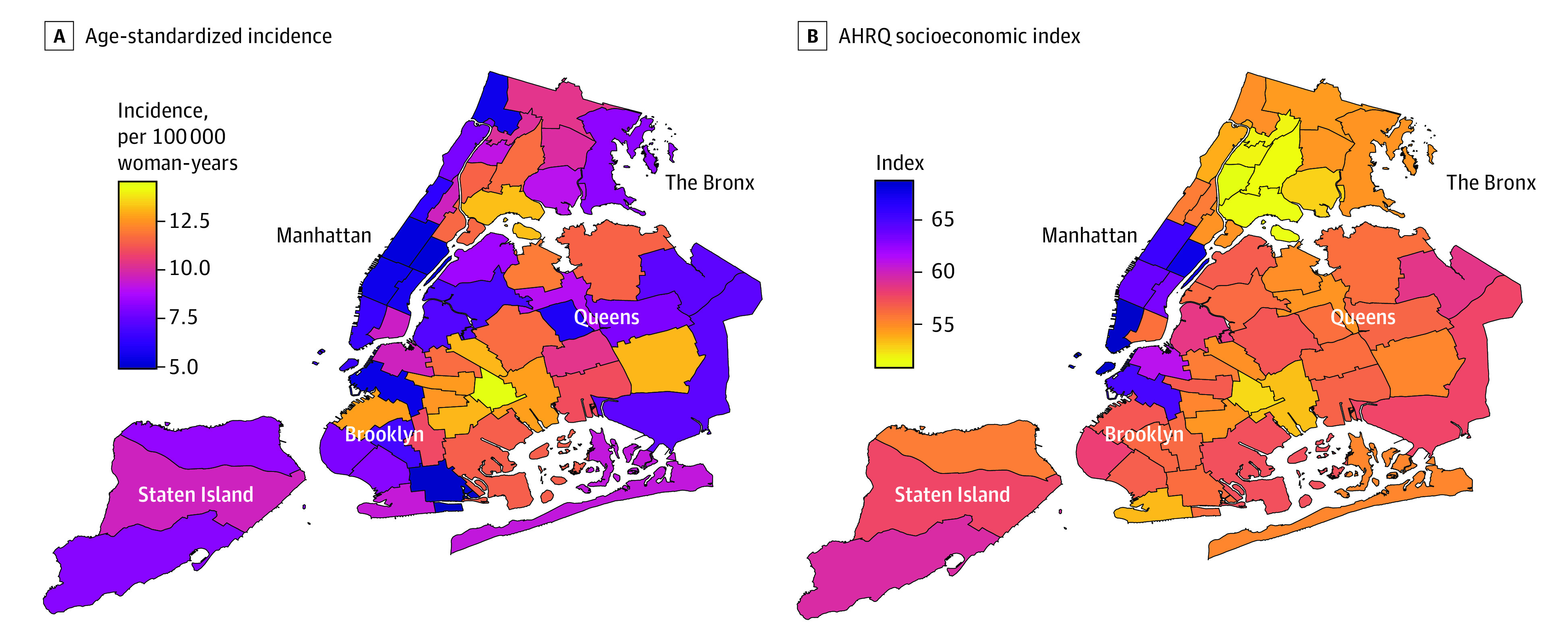
Figure 1. Maps of Cervical Cancer Incidence and Socioeconomic Status in New York City’s Neighborhoods.

Heat maps of New York City neighborhoods show the age-standardized cervical cancer incidence rates (per 100 000 woman-years) (A) and the Agency for Healthcare Research and Quality (AHRQ) Socioeconomic Index (B) by neighborhood in New York City.
