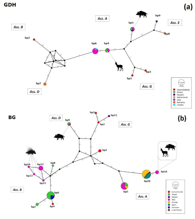
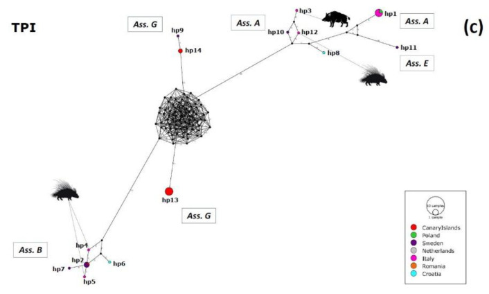
Figure 3.
Gdh (a), bg (b), and tpi (c) Median-Joining haplotype networks built in PoPART software. Haplotypes are represented by circles proportional to relative haplotypes abundance; different colors indicate different areas of origin (see Figure 1 for more details). Numbers in brackets refer to the mutational steps between haplotypes. Black circles represent hypothetical missing haplotypes predicted by the model. Hosts from the present study are represented as black silhouettes. Correspondence between different haplotypes and isolates is indicated in Tables S2–S4.


