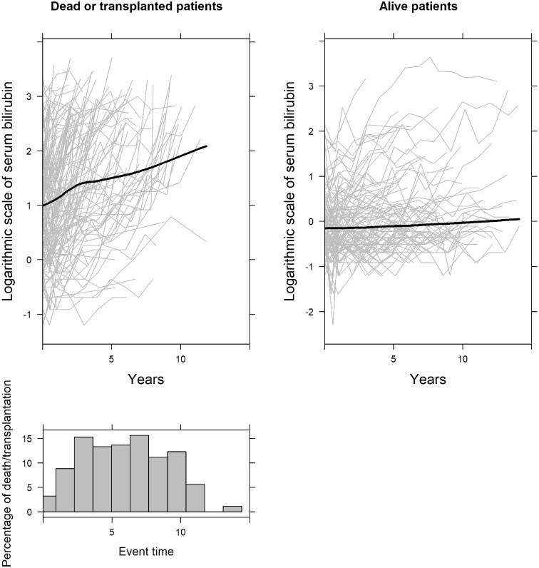
Figure 1.
Evolution of serum bilirubin of all patients per event group, and histogram of event times. The grey lines in the two upper plots represent the serum bilirubin measurements per patient in each event group, and the black solid lines represent the smooth evolution of all the patients in each event group. The histogram indicates the percentage of death/transplantation

