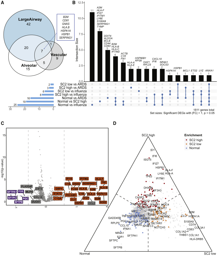
Figure 4.
Spatial transcriptomics identifies tissue- and disease-specific differences
(A) Venn diagram of tissue-specific COVID-19 DEGs (relative to normal, adjusted p values < 0.01, >1-fold) from 16 patients across 357 ROIs in total.
(B) UpSet plot depicting intersections of disease-specific DEGs (p values < 0.05, fold change [|FC|] > 1), also from 16 patients across 357 ROIs in total.
(C) Volcano plot showing differences between normal (n = 3, 64 ROIs) and SARS-CoV-2 high-viral-load samples (n = 4, 86 ROIs) after accounting for compartmental differences. Top genes, in terms of p value or FC are indicated in gray, and COVID-19 Spike-in genes are labeled in black.
(D) Ternary plot of a combined analysis of SARS-CoV-2 high (n = 4, 86 ROIs), low (n = 4, 97 ROIs), and normal (n = 3, 64 ROIs), where genes are projected away from the center based on their marginal means. Genes upregulated in a single group approach that group’s corner. Top genes in terms of p value or FC are labeled. Genes with color were significant with p < 0.05. Genes with outlines are significant after correcting for multiple hypothesis testing.

