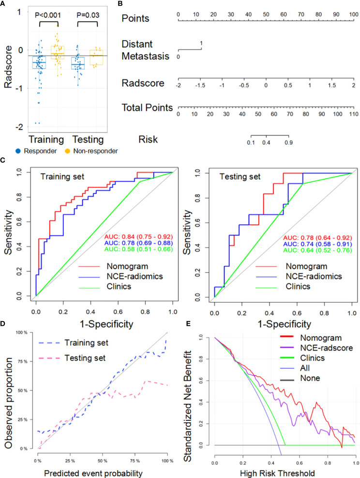
Figure 3.
Performance of the NCE-radiomic models from largest lesion approach in training and testing sets. (A) Box and whisker plots depict radscore comparison between responders and non-responders. (B) NCE-radiomic nomogram developed in training set. (C) ROC curves of radiomics signatures in training and testing sets. (D) Calibration curve analysis for the nomogram in training set and testing set. (E) Decision curve analysis for the nomogram (red), radscore (purple), and clinical model (green). The y-axis indicates the net benefit; x-axis indicates threshold probability. The blue line represents the assumption that all patients were responders. The black line represents the hypothesis that no patients were responders.

