Figure 5.
Quantification of excess synchrony and inference of communication in highly dynamic in vivo microenvironments
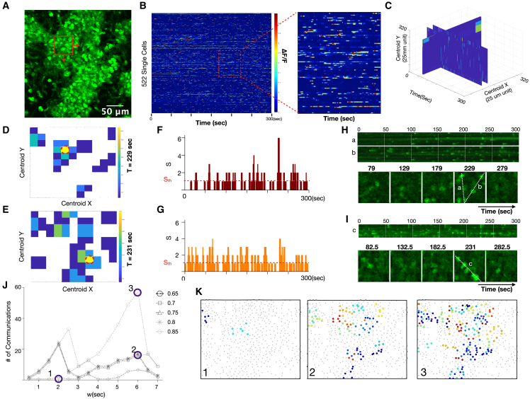
(A) MIP of highly dynamic cellular population in vivo. Scale bar, 80 μm.
(B) Heatmap of 522 single-cell calcium fluorescence dynamics versus time. Color represents normalized calcium-dependent fluorescence changes ΔF/F. Inset shows close-up of individual cells.
(C) Spatiotemporal calcium dynamics as a volume of 50 μm × 50 μm regions shifted by 25-μm increments in the x and y directions over the 300-s (600-sample) time-lapse recording.
(D and E) Two time points where excess synchrony is calculated versus x and y locations. The red dotted circle indicates the location of the highest excess synchrony.
(F and G) Number of calcium elevations (S) versus time for the high synchrony locations circled red in (D) and (E) The threshold for treating S as excess synchrony and considering it a putative cell communication event is shown as a red horizontal dotted line. This line can be increased to create a more stringent threshold for interpreting synchrony as putative cell communication.
(H and I) Line scans (top) and montage of individual time frames (bottom) for the locations circled red in (D) and (E)
(J) Number of inferred communication events as a function of temporal window size and synchrony stringency.
(K) Locations of communication events at different window sizes and synchrony stringency. Color indicates the timing of peak communication (maximum excess synchrony).

