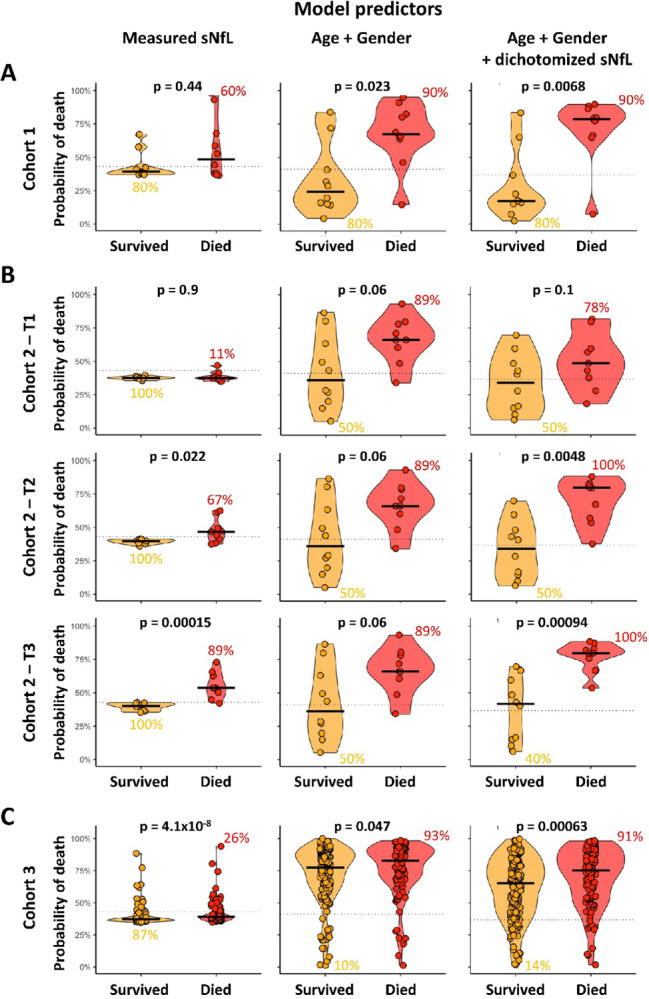
Figure 4:

Comparisons of 3 predictive models of COVID-19 associated mortality: continuous NfL measurement, Age plus Gender, and Age plus Gender plus dichotomized NfL in 3 independent cohorts; (A) cohort 1, (B) cohort 2, and (C) cohort 3. The dotted line on each plot represents the optimal cut-off for respective model predictor. The numerical values beside respective subgroups (Survived or Died) on each plot represents the percentage of correctly classified patients.
