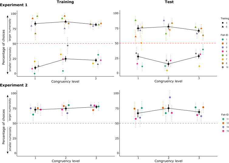
Figure 6. The graphs report the choices for the larger numerosity depending on the different levels of congruency: graphs are reported both for the training phase (mean data of the last two sessions when the criterion was reached) and the test phase, for both Experiments 1 and 2.
In Experiment 1, data are grouped by training condition (circles for fish trained with three dots, triangles for fish trained with six dots). Coloured points represent single fish performance with standard error bars (i.e. data are mediated over trials with the same congruency level, per each fish), while black points represent the overall mean (i.e. data are mediated over all the trials with the same congruency level). Red dotted lines represent chance levels.

