. 2021 Dec 23;10:e71612. doi: 10.7554/eLife.71612

Figure 2. Gerbil medial prefrontal cortex (mPFC) neuron responses during time reproduction.

(A) A cell that linearly increased its firing rate during measurement and ramped down to zero during reproduction. (B) A neuron that scaled its firing with the stimulus duration during reproduction and (C) a ramp-to-threshold cell. (A–C) Panels display spike raster plots sorted by stimulus duration (bottom) and corresponding spike density functions (SDF, top). Each column plots the data with different alignment, that is, measurement begin and end, reproduction begin and end. Color identifies stimulus duration as in Figure 1C. In the raster plots, black ticks are single spikes. For better visualization, we only plot half of the spikes (randomly chosen). Measurement or reproduction phases are delimited by underlayed color. The SDFs are colored in the respective task phase, outside they are displayed as thin gray lines. (D) Dependence of firing on stimulus duration in the example cells. Single markers show the average firing rate or change of firing rate at each stimulus duration. Open dots are used for data from measurement and filled squares for those from reproduction. Solid lines are linear fits. Pearson’s correlation coefficient and significance is given in the lower-right corner. Above each panel, cell and task phase is indicated. The averages of firing rate and its change were calculated from the last half of the SDFs in the corresponding task phase.

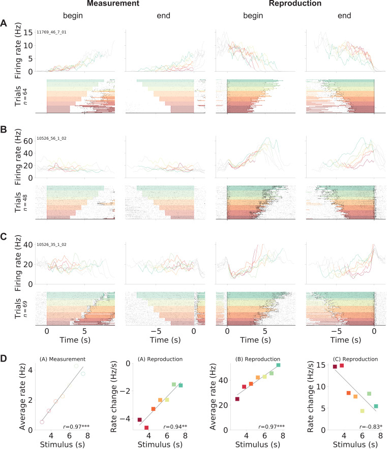
Figure 2.

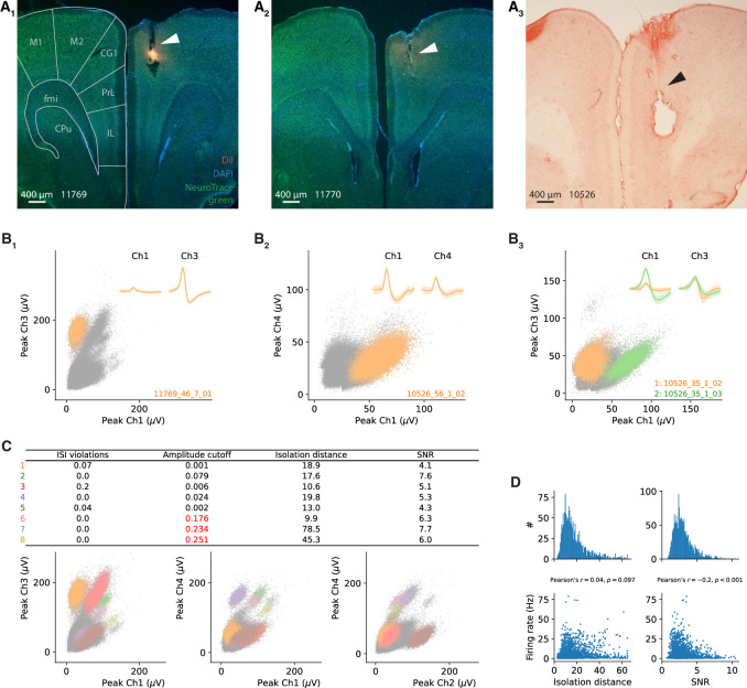
Figure 2—figure supplement 1. Electrophysiological recordings in gerbil medial prefrontal cortex (mPFC) – histology and spike sorting.

Figure 2—figure supplement 1.

(A) Representative coronal sections of the brains of all three gerbils. Tetrode tracks are visible in right cingulate cortex. In addition, stains from DiI coating of the tetrodes are visible in (A1, A2), and a big postmortem electrolytic lesion in (A3). Background staining was done with DAPI and Neurotracer (A1, A2) and Neutralred (A3). A section from a gerbil brain atlas is overlaid in (A1) (Radtke-Schuller et al., 2016). M1, M2, primary and secondary motor cortex; CG1, cingulate cortex, area 1; PrL, prelimbic cortex; IL, infralimbic cortex; fmi, forceps minor of corpus callosum; CPu, caudate putamen. (B) Spike clusters in feature space of signals recorded at one tetrode; data from three different example sessions. (B1) Cell from Figure 2A in the main text. (B2) cell from Figure 2B in the main text. (B3) cell from Figure 2C (orange) in the main text and Figure 2—figure supplement 3A (green). Peak signals are shown for two different channels of one tetrode as an example projection. Other spikes and voltage deflections are displayed as gray dots. Insets: average waveforms (1 ms length) corresponding to the colored clusters. (C) Three different projections of the feature space from the tetrode recoding in (B1). All eight spike clusters that could be separated are marked (color coded). Other spikes and voltage deflections are again displayed as gray dots. The table lists quality measures for each cluster. Clusters 6–8 had too large amplitude cutoff and were excluded from further analysis. (D) Distributions of isolation distance and signal-to-noise ratio (SNR) for the clusters of all 1766 cells (i.e., excluding clusters/cells of insufficient quality). Both values were weakly correlated with the average firing rate (bottom panels). Isolation distance was calculated as described in Schmitzer-Torbert et al., 2005 for clusters of the peak amplitude (C). SNR was calculated as the ratio of the peak of the average spike waveform to the standard deviation of the background noise, that is, spikes that do not belong to a separated cluster. This was done for every channel individually and then averaged for all channels of a tetrode. Interspike interval (ISI) violations and amplitude cutoff were calculated as described in the Materials and methods section.
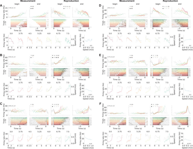
Figure 2—figure supplement 2. Ramping neurons.

Figure 2—figure supplement 2.

(A–C) Example cells from Figure 2 in the main text. (D) Another cell that linearly increased its firing rate during measurement and ramped down to zero during reproduction. (E) A neuron that responded constantly but somewhat modulated by stimulus duration during measurement and ramps to threshold during reproduction. (F) Another ramp-to-threshold cell. (A–F) Panels display spike rasters sorted by stimulus duration (bottom) and corresponding spike density functions (SDF, top). Each column plots the data with different alignment, measurement begin and end, reproduction begin and end. Color identifies stimulus duration (Figure 1C). In the raster plots, black ticks are single spikes. For better visualization, we only plot half of the spikes (randomly chosen). Measurement or reproduction phases are delimited by underlayed color. The SDFs are colored in the respective task phase, outside they are displayed as thin gray lines. Markers in second and third panels show percent explained variance for each principal component (see Figure 5). Black dots – which may be connected by a line – illustrate the cell type according to categorization (see Figure 6). Bottom panels compare SDF (color coded) to average (virtual) running speed (gray) for each stimulus duration. Bottom-right panels plot the tuning curves for virtual speed (speed response function). Modulation index and significance is given in the lower-right corner.
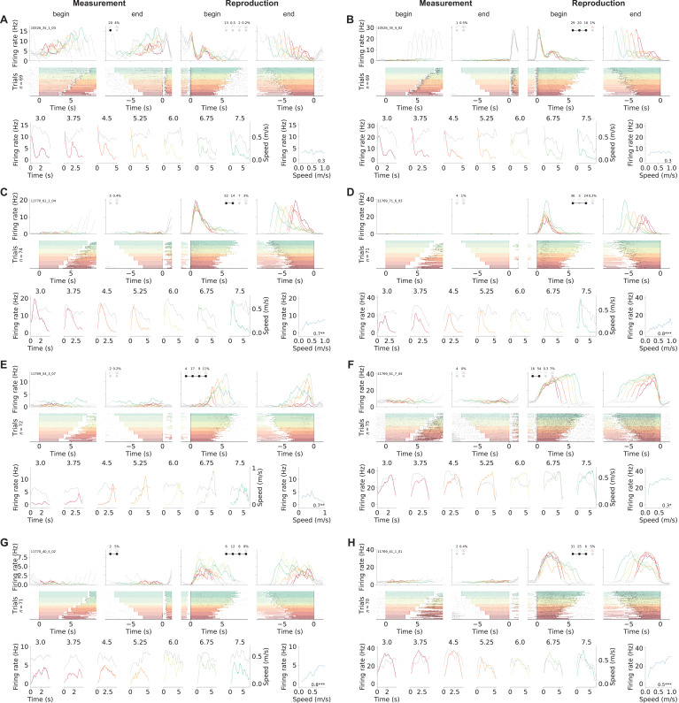
Figure 2—figure supplement 3. Phasically timing neurons.

Figure 2—figure supplement 3.

(A–H) Examples of neurons that showed phasic responses at specific time points or for a certain duration in the reproduction phase. Note that the cell in (E) signals absolute time as it starts firing at 4 s – and proceeds until shortly before the end of the reproduced interval. (C–H) Neurons with pronounced modulation by (virtual) running speed. Plots are organized as in Figure 2—figure supplement 2.
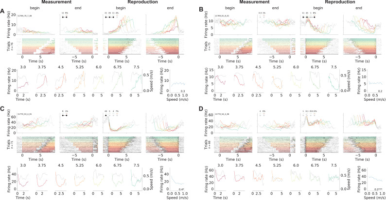
Figure 2—figure supplement 4. Other example neurons.

Figure 2—figure supplement 4.

(A) A neuron that during reproduction appeared very similar to the cell in Figure 2—figure supplement 3F, but in fact does not signal absolute but relative time as it starts firing later for longer stimuli. (B–D) Cells that during reproduction responded with brief (D) or extended drops of activity (B, C). The amount of activity reduction may (B) or may not (C) have scaled with the stimulus duration. All plots are organized as in Figure 2—figure supplement 2.
Figure 2—figure supplement 5. Influence of speed on single neuron responses.

Figure 2—figure supplement 5.

Distributions of modulation indices derived from the speed response functions of each neuron for virtual speed (A) and running speed on the treadmill (B). Neurons with significant speed tuning are delimited by the orange outline (i.e., with variance of their speed response function larger than that of the speed response function for shuffled spike times; significance assessed by Levene’s test p<0.05). Black outline gives histogram for cells with ramp-like responses only (cells explained by PC 1 and those explained by PC 1 + stimulus PC 1, see categorization analysis below and Figure 6). Pie plots show significant (orange) and nonsignificant (blue) fractions. Raised wedges mark ramping neurons. (C) Modulation indices for virtual speed vs. running speed for each neuron (blue dots). Ramping neurons are marked with black dots.