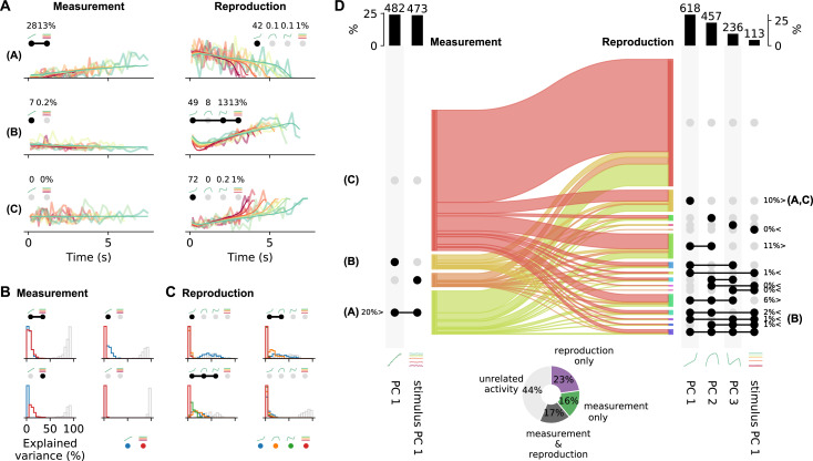
Figure 6. Single-cell activity and their contribution to the population response change from measurement to reproduction.
(A) Reconstructions (thin lines) of the firing patterns (spike density functions [SDFs], thick faint lines) of the example neurons from Figure 2 (identified by bold letters; note that here SDFs were not smoothed). Markers show percent explained variance for each principal component (PC) and illustrate the response type according to the categorization (see D). For instance, the neuron in the first row is reconstructed by the linear combination of PC 1 and stimulus PC 1 during measurement and with (negative) PC 1 during reproduction. (B) Distributions of variance of single-cell responses explained by PCs during measurement. Variance explained by PC 1 is displayed in blue and by stimulus PC 1 in red. The remainder (i.e., variance unexplained) is displayed as gray open bars. Each panel displays distributions for cells belonging to one of the four possible response categories visualized by the markers above the panel. (C) Same as (B) for the reproduction phase. Here the coloring is PCs 1–3, blue, orange, green; stimulus PC 1, red. Distributions are displayed for the four categories with the most cells. (D) Transition between response categories from measurement to reproduction (Sankey diagram). At the margins the numbers of cells are given with activity patterns that can be reconstructed by PCs. For measurement (left), PC 1 and stimulus PC 1 were considered and for reproduction (right) PCs 1–3 and stimulus PC 1. Dark dots indicate the contribution of a PC to a response category. Percentages are only given for categories that contain significant numbers of cells compared to shuffled data. The signs < and > indicate if the number is smaller or larger than for shuffled data. Zero percentages mean less than 1%. Bold letters correspond to the examples from (A).Bar graphs at the top show percentages and cell numbers with contributions of each PC. Pie chart at bottom shows percentages of cells active during the task phases determined from the reconstructions.

