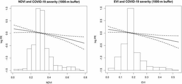
Fig. 2.
Exposure-response curves of the association between greenness in 1000-m buffer radius with COVID-19 severity. log PR: log prevalence ratio. The solid line shows the exposure-response curve, dotted lines show the 95% CI of the exposure-response curves, histograms of greenness distribution are shown on the x-axis. All the models were adjusted for age, gender, days from symptom onset to diagnosis, population density, nighttime light.

