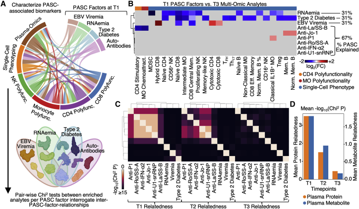
Figure 6.
Integrated analysis of associations between multi-omics and PASC factors
(A) Illustration of the analysis to identify how the different PASC factors associated with the different multi-omic measurements.
(B) Cross-dataset correlations between T1 measurable PASC-associated factors (EBV viremia, RNAemia of SARS-CoV-2, and auto-antibodies) and analytes from different T3 omics (see color key at bottom). Association was quantified via log2-fold change values where red indicates positive associations, blue indicates negative association, and gray indicates no significant associations (p ≥ 0.01).
(C) Heatmap visualization of the interdependence of the four PASC factors across three time points. The relatedness score represents how significantly the enriched plasma protein sets for each PASC factor overlapped with each other. These are visualized in a pair-wise manner in the matrix.
(D) Bar plot illustrating the quantification of the relatedness from (C) plus an analogous analysis for plasma metabolites. The bar heights represent the average non-self pair-wise relatedness value from the heatmaps in (C) with separate y axes for plasma proteins and plasma metabolites. See also Figure S6 and Table S7.

