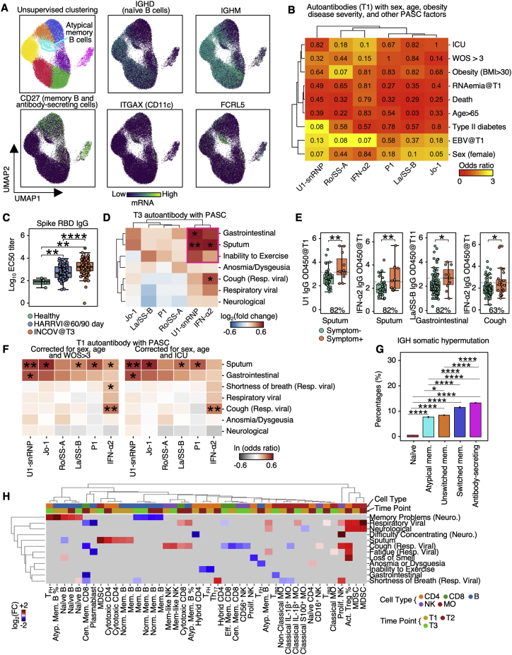
Figure S2.
Auto-antibodies anticorrelate with anti-SARS-CoV-2 antibodies and are associated with distinct patterns of PASC, related to Figure 2
(A) UMAP visualization of single B cells color-coded by Leiden clusters (top left) and selected gene transcript levels (other panels).
(B) Heatmap showing the odds ratio (color-coded) and p values (shown in numbers) from Fisher’s exact test to determine the dependence of column and row variables.
(C) Boxplot showing titers of SARS-CoV-2 spike RBD antibodies in healthy, INCOV, and HAARVI at convalescence (T3 for INCOV, and 2–3 months post infection for HAARVI). p values calculated from the Mann-Whitney U test are displayed. ∗∗p value < 0.01, and ∗∗∗∗p value < 0.0001
(D) Hierarchical clustered heatmap showing log2-fold change of T3 autoantibody levels in patients with a specific PASC (rows) compared to those without. p values calculated from the Mann-Whitney U test are displayed if <0.05. ∗p value < 0.05, ∗∗p value < 0.01.
(E) Boxplots showing all significant PASC- autoantibody (T1) relationships in Figure 2C. The percentages of patients with a given PASC that had autoantibody levels greater than the median antibody level of those who did not present the PASC are shown. p values calculated from the Mann-Whitney U test are displayed if <0.05. ∗p value < 0.05, ∗∗p value < 0.01.
(F) Heatmap showing associations between T1 autoantibody measurements and PASC, accounted for sex, age, and disease severity (left: WOS > 3, right: ICU). Each rectangle represents the ln(odds ratio) determined through multi-variate logistic regression. p values are displayed if <0.05. ∗p value < 0.05, ∗∗p value < 0.01.
(G) Bar plots showing mean SE somatic hypermutation rates in CDR regions of the heavy chain in different B cell populations. p values calculated from Mann-Whitney U test then corrected as FDR via the Benjamini-Hochberg method are displayed if FDR < 0.05. ∗FDR < 0.05, ∗∗∗∗FDR < 0.0001.
(H) Associations between phenotype percentages as measured for all three time points (columns) and PASC (rows). The immune cell class is color-coded on the top row, and the measurement time point is color coded on the second row. Enrichment is quantified as log2-fold changes between patients with PASC compared with those without. These are colored as red for positive, blue for negative, and statistically non-significant fold changes are shown as gray (p ≥ 0.05).

