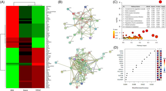
FIGURE 2.

Serum proteomics profile of coronavirus disease‐2019 (COVID‐19) study cohort. (A) Heatmap showing significant proteins increasing or decreasing in accordance with disease severity. Columns correspond to the degree of disease severity: mild (left), severe (centre) and critical (right) groups. Mean values for each compound in each coronavirus disease‐2019 (COVID‐19) group (columns) are colour‐coded based on relative abundance, low (red) & high (green). Among the 65 significant proteins, 33 increased and 32 decreased with disease severity. (B) Up‐(upper) and down‐(bottom) regulated protein networks sorted by gene‐name showing a tight interconnection within the up‐ and down‐regulated proteins. (C) Kyoto Encyclopedia of Genes and Genomes (KEGG) enrichment analysis sorted by pathway impact and ‐log10 (p). The interconnected up‐ and down‐regulated genes were enriched in 77 pathways, and the 10 relevant pathways whose impact values were greater than 0.1 (p < .05) were further considered. The bubble diagram shows matched pathways according to the p‐values and pathway impact values. The size of bubbles shows pathway impact value and the colour denote the level of significance by means of p‐values. Numbers in circles correspond to the significantly enriched pathways ordered from the highest to the lowest pathway impact value. The number of matched proteins, impact value and p‐value corresponding to each pathway are indicated on the inserted table. (D) Random forest analysis showing the 15 protein‐encoding genes ranked by classification accuracy to distinguish between a mild and critical group of patients. Squares on the right represent the COVID‐19 (1 = mild, 2 = severe and 3 = critical) and the colours depict the accuracy power (red and blue for high and low accuracy, respectively)
