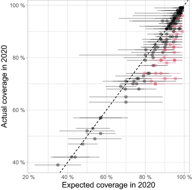
Fig. 2.
Comparison between 2020 WUENIC-reported DTP3 coverage and expectations derived from historical trends. This scatterplot shows country coverage (WUENIC-reported actual values and ARIMA-predicted expectations) as dots. Lines around individual points illustrate the 95% confidence intervals (CI) of ARIMA predictions. Countries showing significant departure from expected values, i.e., for which actual coverage is outside the 95% CI of predictions, are indicated in red; countries without such significant departure from expected results are shown in black. (For interpretation of the references to colour in this figure legend, the reader is referred to the web version of this article.)

