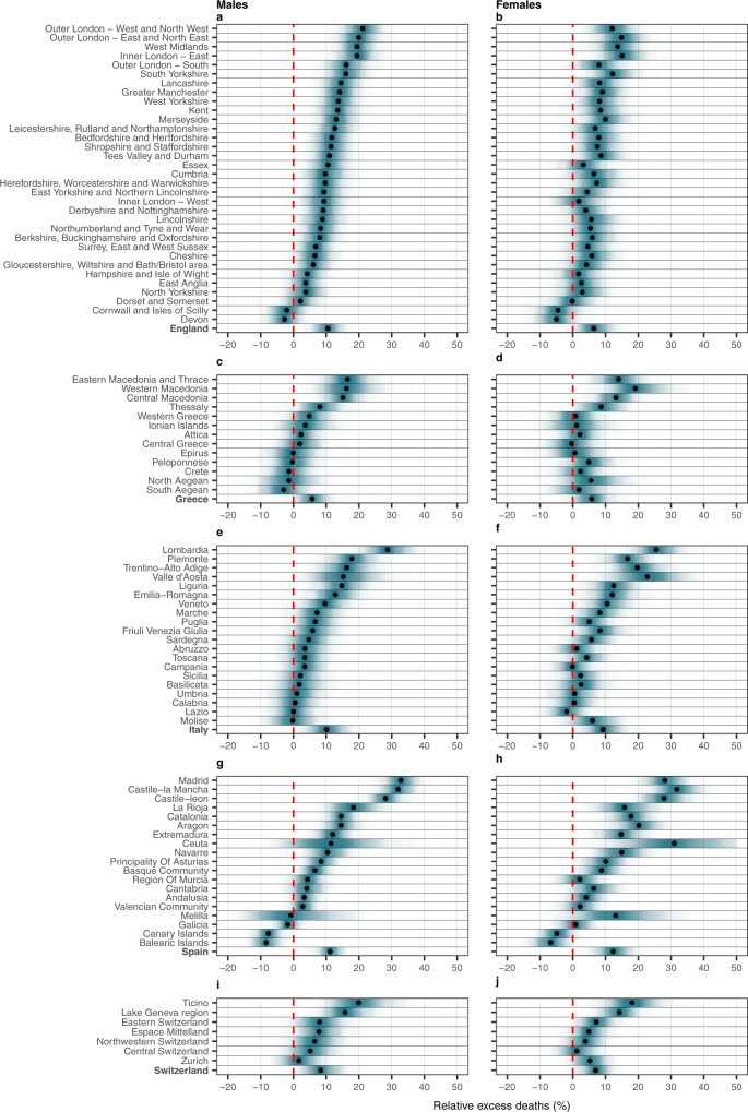
Fig. 1. Posterior distribution of relative excess deaths (%) across the different countries by NUTS2 region and sex in 2020.
a Posterior distribution of relative excess deaths (%) in males in England. b Posterior distribution of relative excess deaths (%) in females in England. c Posterior distribution of relative excess deaths (%) in males in Greece. d Posterior distribution of relative excess deaths (%) in females in Greece. e Posterior distribution of relative excess deaths (%) in males in Italy. f Posterior distribution of relative excess deaths (%) in females in Italy. g Posterior distribution of relative excess deaths (%) in males in Spain. h Posterior distribution of relative excess deaths (%) in females in Spain. i Posterior distribution of relative excess deaths (%) in males in Switzerland and j posterior distribution of relative excess deaths (%) in females in Switzerland. The black dots represent the medians of the posterior distribution of relative excess deaths. The red line highlights the 0% relative excess deaths, which means no observed difference in the 2020 mortality compared to the counterfactual scenario that the pandemic did not occur.

