Figure 8.
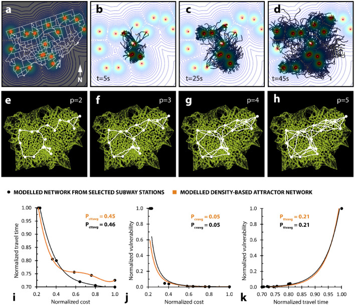
Comparison between modelled networks generated with population-density- and subway-station-defined attractor points. (a) Dot density population distribution of city of Toronto, where each dot represents 150,000 residents (b–d) Modelled growth to establish mesh to describe hypothetical subway system, based off attractors generated in a. (e–h) Different shortest-walk calculations for the same mesh, generated from d, but with unique proximity coefficient values. (i) Plot relating network cost to travel time for both density-based network model (orange) and station-based network model (black). Trendlines are both fourth-order polynomial functions. (j) Plot relating network cost to vulnerability for both density-based network model (orange) and station-based network model (black). Trendlines are both power functions. (k) Plot relating network travel time to vulnerability for both density-based network model (orange) and station-based network model (black). Trendlines are both exponential functions. All performance values normalized to the largest local value. Modelled average performance values displayed on the plots represent average performance values cross all network iterations.

