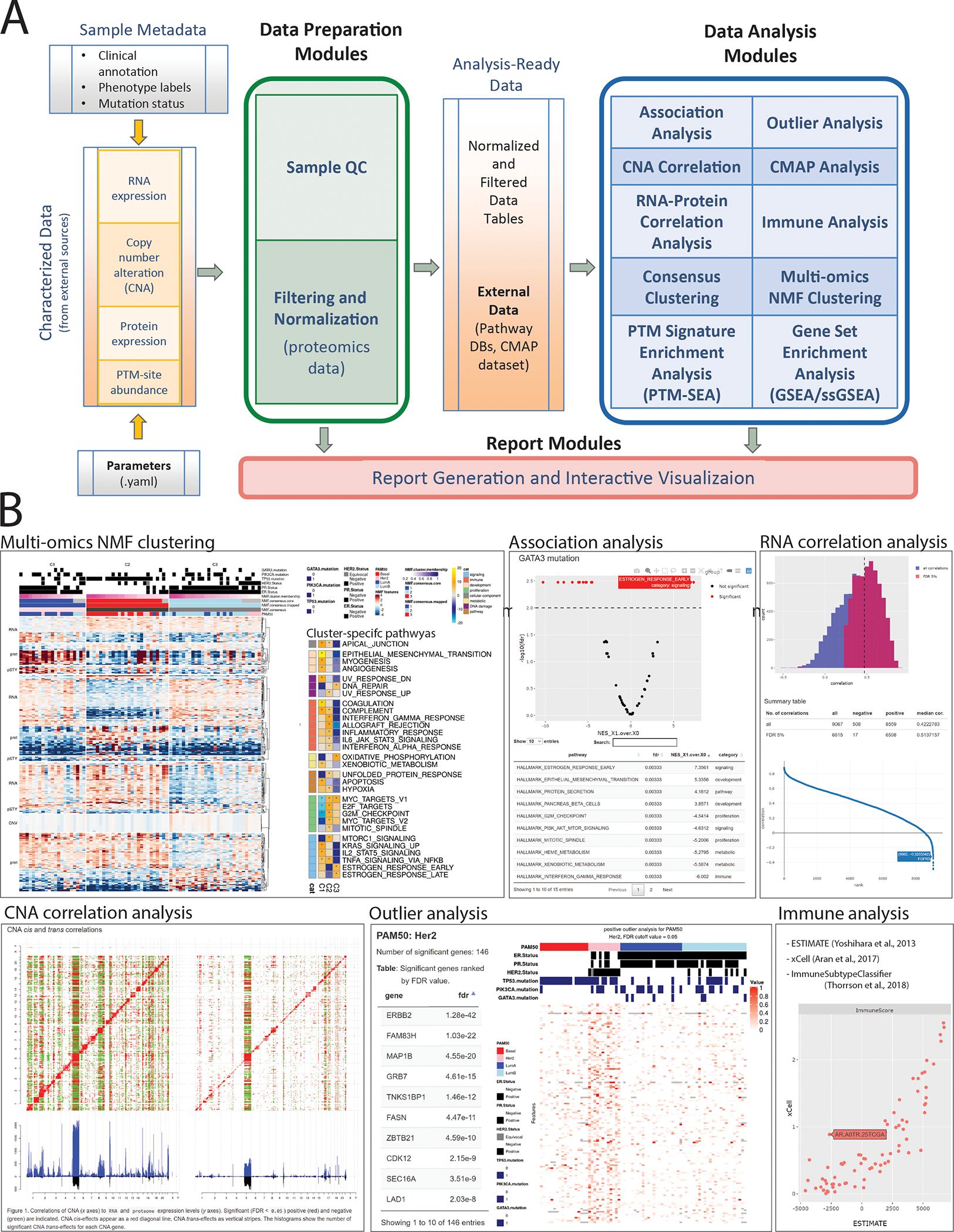
Figure 1.

Overview of PANOPLY architecture and the various tasks that constitute the complete workflow. Tasks can also be run independently, or combined into custom workflows, including new tasks added by users. (A) Inputs to PANOPLY consists of (i) externally characterized genomics and proteomics data (in gct format); (ii) sample phenotypes and annotations (in csv format); and (iii) parameters settings (in yaml format). Panoply modules are grouped into Data Preparation Modules (green box), Data Analysis Modules (blue box) and Report Modules (red box). Data preparation modules perform quality checks on input data followed by optional normalization and filtering for proteomics data. Analysis ready data tables are then used as inputs to the data analysis modules. Results from the data analysis modules are summarized in interactive reports generated by appropriate report modules. (B) A sampling of reports from PANOPLY for the tutorial BRCA dataset 1 that can be explored in a web browser. The full suite of reports (html) derived from the tutorial dataset can be accessed and explored at http://prot-shiny-vm.broadinstitute.org:3838/panoply-tutorial/reports, with an interpretation summary at https://github.com/broadinstitute/PANOPLY/wiki/Navigating-Results. Multi-omics NMF clustering: Heatmap (left) depicts multi-omics expression patterns across three NMF clusters derived from integrative clustering of copy-number alterations (CNA), RNA, protein and phosphosite data. Annotation tracks depict mutation status of key BRCA genes (TP53, GATA3, PIK3CA), hormone receptor status (ER, PR, HER2) and PAM50 transcriptional subtypes. Right heatmap shows activity scores of cancer hallmark pathways for the three NMF clusters. Association analysis: Interactive volcano plot illustrating differentially abundant signatures of cancer hallmark pathways between tumors with GATA3 mutations (right side) compared to GATA3 wild-type tumors (left side). A browseable table summarizes the results. RNA correlation analysis: Histogram of all (blue) and significant (red, FDR < 0.05) gene-level Pearson correlations between RNA and protein data. A table summarizing high-level results and an interactive correlation (y-axis) rank (x-axis) plot enables further exploration of the results. CNA correlation analysis: pairwise gene-level correlations between CNA (x-axis in both panels) and RNA (y-axis, left panel) and proteome (y-axis, right panel). Significant (FDR < 0.05) positive (red) and negative (green) correlations are indicated. CNA cis-effects appear as a red diagonal line, CNA trans-effects as vertical stripes. The histograms show the number of significant CNA trans-effects for each CNA gene. Outlier analysis: Phospho-level outlier analysis showing outliers in the HER2 PAM50 subtype in a searchable table and accompanying heatmap. Immune analysis: Computational approaches to infer immune/stromal tumor components, and immune subtype from RNA expression data are implemented in PANOPLY. Shown are immune scores derived from ESTIMATE9 (x-axis) and xCell10 (y-axis) for 77 BRCA tumors.
