. 2022 Jan 26;11:e64543. doi: 10.7554/eLife.64543

Figure 3. Model performance.

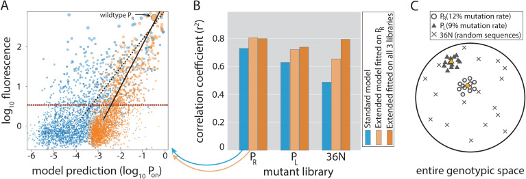
(A) Model-to-data correlation for the Standard (blue) and the Extended model (orange) trained on PR only, shown for the evaluation subset (20%) of the PR mutant library. The experimentally measured fluorescence of each mutant is the mean bin (out of four) across all sequenced reads of that mutant (we only consider mutants with at least 30× coverage). Best-fit line (dashed for the Standard model, solid black for Extended) and the instrument detectability threshold, which we refer to as the ‘measurable expression’ and which marks the 99th percentile of plasmid-free strain (red dashed line), are shown. Marker sizes indicate data-point weights used in fits. We assume that the model predictions are independent of the instrumentally determined measurable expression threshold. (B) Model performance on mutant libraries (PR, PL, 36N), shown as fraction of variance explained on evaluation data. Arrows indicate which bars correspond to the correlation plot shown in (A). (C) Cartoon of the three mutant libraries: PR and PL sample locally around a wildtype, with each position having a 12% or 9% chance, respectively, of containing the non-wildtype residue; 36N library contains random 36-bp-long sequences, meaning that it uniformly samples the full 36-bp-long genotypic space (see Figure 3—figure supplement 2G). Colored circle and triangle represent the wildtype PR and PL sequences, respectively. Figure 3—source data 1, Figure 3—source data 2 provide additional details on the processing of mutant libraries, as does the Figure 3—figure supplement 2. Figure 3—figure supplement 1 shows the performance of the two models on previously published datasets of promoter mutants. Figure 3—figure supplement 3 shows the plate reader validation of 36N library data processing.

Figure 3—source data 1. Processing of the mutant libraries and sizes of datasets after splits.
The table shows the number of reads remaining in the datasets following each step of data processing, from original sequenced library down to the final library used for model fitting and evaluation.
Figure 3—source data 2. Number of mutants per expression bin for each split of the PR, PL, and 36N dataset.
Bins are no (‘0’), low (‘1’), intermediate (‘2’), and high (‘3’) for the PR and PL libraries, and are ordered from lowest (‘0’) to highest (‘11’) for the 36N library.

Figure 3.

Figure 3—figure supplement 1. Performance of Standard and Extended model on previously published datasets.
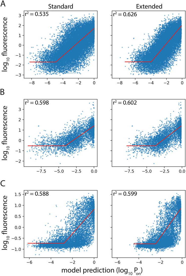
Figure 3—figure supplement 1.

Expression level predictions from the Standard and the Extended model were correlated to measured expression levels, in the promoter mutant libraries published by (A) Johns et al., 2018; (B) Hossain et al., 2020; (C) Urtecho et al., 2019. Red line shows the line of best fit, resulting in the reported correlation coefficient, r2.
Figure 3—figure supplement 2. Processing of mutant libraries.

Figure 3—figure supplement 2.

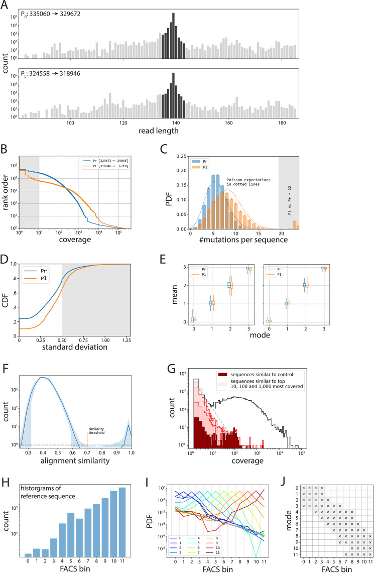
(A–E) Processing of PR and PL libraries. (A) All reads in the PR and PL libraries (gray), from which we take only those reads that are ±4 bp away in length from the wildtype sequence (dark gray). (B) Inverse cumulative distribution function (normalized to the total number of sequences), with shaded indicating the sequences we removed due to having less than 10× coverage. (C) We removed sequences that had 20 or more single point mutations compared to their respective wildtype sequence. Note that this mainly affected the PL library (orange), as the original plasmid from which the libraries were cloned contained the wildtype PR sequence. (D) Cumulative distribution function (CDF) of standard deviation of expression bin numbers, with shaded sequences the ones we removed from subsequent analyses. (E) Box plots indicating the distributions of mean values (in bin units) for a given mode (in bin units), before (left) and after (right) selecting for only those where mean, mode, and median are within 0.5. (F–J) Processing of the 36N library. (F) Average histogram of alignment similarity for the 1000 most covered sequences (shaded area indicates 95% confidence interval). We used the similarity threshold of 0.7 between low- and high-scoring modes to select for unique sequences and eliminate sequencing errors. (G) Histogram of coverage (black line), with highlighted contributions of the noise cloud around the reference sequence (dark red), and the clouds around the 10, 100, and 1,000 most abundant sequences (from darkest to lightest shade of red, respectively). (H) Histogram of counts for the reference sequence per bin, used to debias all other distributions. (I) Template probability distribution functions (PDFs) obtained as averages of PDFs that have the same mode (indicated by color). The inferred fluorescence activated cell sorting (FACS) noise background is shown as a thick gray line. Given a distribution, we only accepted values in the bins in which the appropriate reference was three times above the inferred background. Such filter is shown in (J).
Figure 3—figure supplement 3. Plate reader validation of 36N data processing.

Figure 3—figure supplement 3.

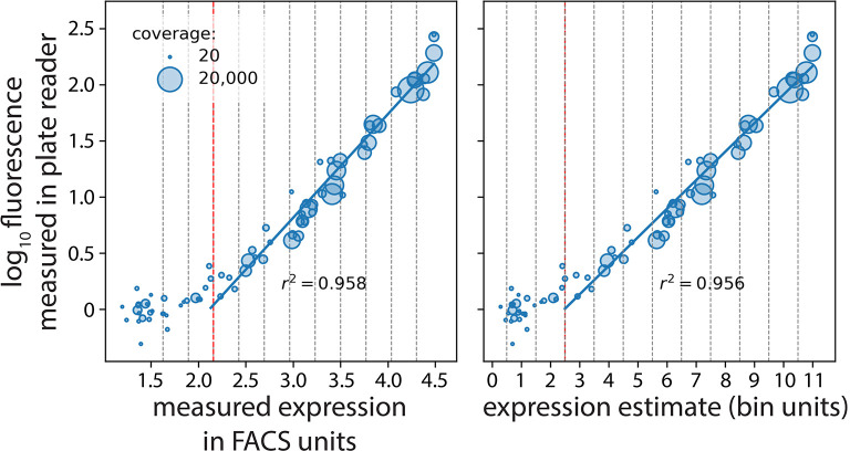
Seventy-seven mutants (with an approximately equal number of mutants selected from each of the 12 bins) were selected randomly and their expression levels measured in a plate reader. We correlated their expression measured in the plate reader with our estimates in fluorescence activated cell sorting (FACS) units (left) and bin units (right). The vertical red dotted line marks the measurable expression threshold in the flow cytometer. Measured expression in FACS units and expression estimate are shown in log scale.