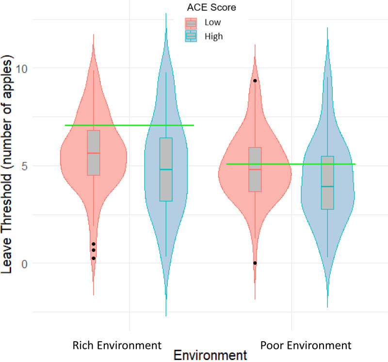
Fig. 1.
Violin and boxplots demonstrating the leaving thresholds for each environment. The central line in each boxplot refers to the mean. Upper and Lower lines reflect the upper and lower quartiles, respectively. Black dots identify outliers that are greater than 1.5 times the interquartile range from the upper and lower quartiles. Horizontal green bars indicate the optimal leaving thresholds for each environment. Higher leaving threshold indicates more exploration and less exploitation.

