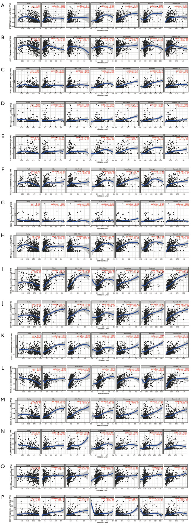
Figure 8.
The correlation between CXC chemokines and immune cell infiltration abundance (TIMER). The x-axis represents the abundance of immune cell infiltration. The y-axis represents the expression levels of CXC chemokines. The blue line represents the trend of expression level. The scatter represents the distribution of the expression value for each sample.

