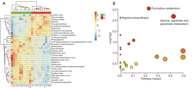
Figure 3.
Heatmap of the metabolic profiles between the two groups and bubble plots from the enrichment analysis. (A) Heatmap of changes in the levels of 36 metabolites in response to the treatment group compared to the control group. Red indicates upregulation; blue indicates downregulation. T, treatment group; C, control group. (B) Bubble plots of the enriched metabolic pathway.

