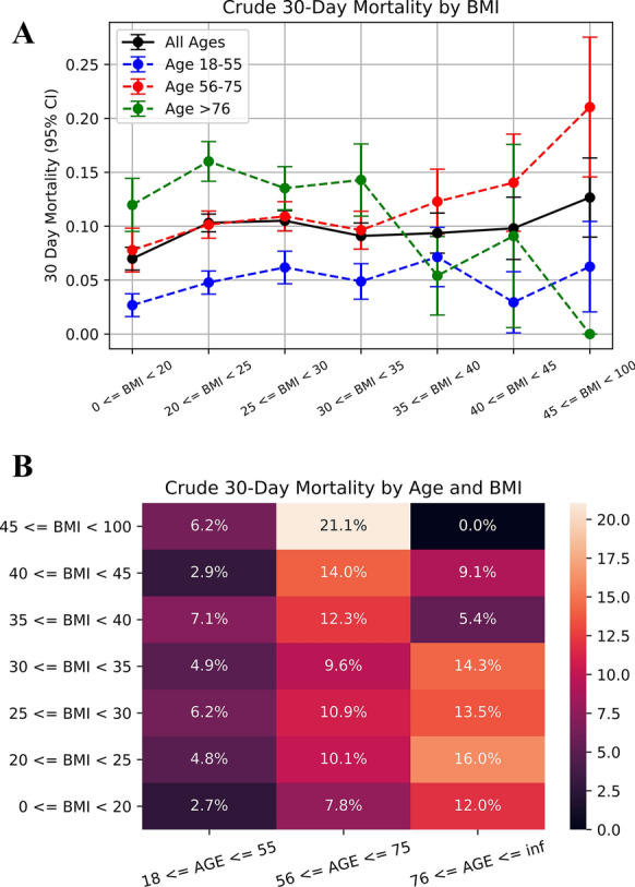
Fig. 1.

Relationship between BMI and mortality, stratified by age. A Trends for mortality based on BMI are visualized, after stratifying by age. Whiskers show 95% confidence intervals. Blue: age group 18–55, red: age group 56–75, green: age group ≥ 76, and black: all ages. B An alternative visualization of the BMI-death relationship as a heatmap coded for the crude 30-day mortality rate. Again, data has been stratified by age. Dark colors represent lower mortality rates; light colors represent higher mortality rates. BMI, body mass index; CI, confidence interval
