Fig. 3.
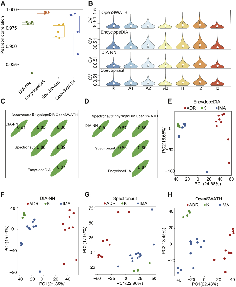
PulseDIA proteome data quality control (QC) analysis.A, the box plot shows the Pearson correlation coefficient of five technical replicates in four DIA software quantification. B, the violin plot shows the distribution of the coefficient of variation (CV) of each protein's quantitative values in the three biological replicates. Three lines of the black box inside the violin represented lower quartile, median, and higher quartile, respectively. C, Spearman correlation coefficient of overlapped 30,289 peptide quantitative values in the four DIA software. D, Spearman correlation coefficients of overlapped 4493 protein in the four DIA software. E–H, PCA plot shows the distribution of the samples in the first two principal component levels. The red, blue, and green dots indicate samples from model ADR, model IMA, native K562 cells, respectively. ADR, adriamycin; DIA, data-independent acquisition; IMA, imatinib; PCA, principal component analysis.

