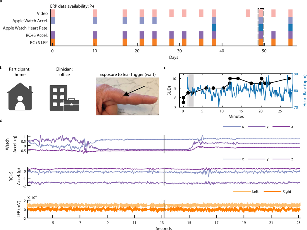
Figure 5: Intracranial electrophysiology during Exposure and Response Prevention Teletherapy at home with Participant P4.
(A) Calendar availability plot of ERP sessions for participant P4, over days since the first ERP session. Shaded portions indicate data availability for ERP video, Apple watch heart rate, Apple watch acceleration, RC+S® acceleration, and RC+S® LFP. Rectangular dotted line corresponds to the ERP session example data shown in panels B-D. (B) Video of participant P4 (left), clinician (center), and image of exposure (right). (C) Time-course in minutes of self-reported Subjective Units of Distress (SUDs) ratings and heart rate collected via the Apple Watch throughout the ERP session. Vertical black line denotes the start of the exposure period. Gray shaded area corresponds to the time period shown in supplemental video 2. (D) 20 seconds of example data synchronized to video, including apple watch acceleration, RC+S® acceleration, and two bipolar LFP channels. Vertical black line corresponds to the video frame shown in panel B.

