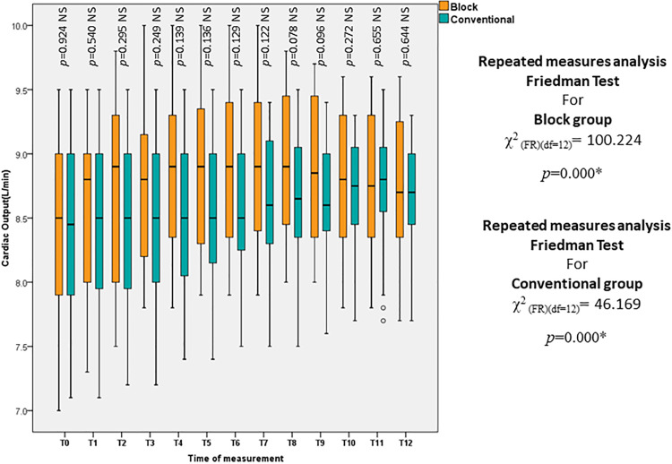
Figure 4.
Box and whisker graph of cardiac output (L/min) in the studied groups, the thick line in the middle of the box represents the median, the box represents the interquartile range (from 25th to 75th percentiles), the whiskers represent the minimum and maximum after excluding outliers (circles) and extremes (black asterisks), the * is for statistical significance (p<0.05).

