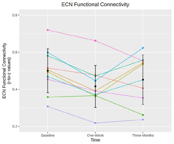
Figure 3.

Executive control network (ECN) connectivity by participant. Spaghetti plot showing individual changes in mean ECN connectivity scores (y-axis) and time point (x-axis). Error bars represent mean ± standard deviation. Colours represent individual participants. ECN connectivity is significantly decreased at 1 week but not at 3 months.
