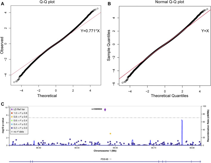
FIGURE 1.
The quantile-quantile plot of the pooling-based genome-wide association analysis and the association results of the PDE4B region. The quantile-quantile (QQ) plots were drawn before (A) and after (B) standard normal distribution transformation. The X-axis indicates the observed quantiles of the Z score in our analysis, and the Y-axis indicates the quantiles of the Z score under a standard normal distribution. The red line indicates the standard line passes through the first and third quartiles. The formula of the standard line in (A) was Y = 0.771*X, which indicates our results conform with a normal distribution with a standard deviation equal to 0.771. (C) Association signals in the PDE4B region. The plot was drawn by LocusZoom. The X-axis indicates the physical position of each genotyped SNP according to the human genome reference (hg19). The left Y-axis indicates the log transformed p-value, which was used for labeling the dots and rhombus, and the right Y-axis indicates the recombination rate, which was used for labeling the blue lines in the main figure. The rhombus indicates rs10889602T/G. The color of the dots represents the linkage disequilibrium with rs10889602T/G measured by R 2 (legend at left).

