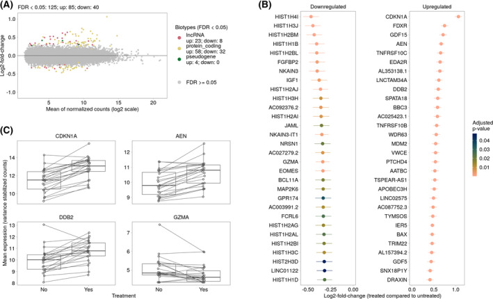
Fig. 3.

Differential gene expression analysis between treated and untreated GBM tissue samples. (A) The MA‐plot represents the relationship between normalized mean expression values and lfcs for all analyzed genes. Each dot represents a gene. Significantly DEGs (FDR < 0.05) are colored according to their gene biotype. The legend shows the number of significantly upregulated (up) and downregulated (down) genes for each gene biotype. (B) Top 20 down‐ and up‐regulated significantly regulated genes (treated compared to untreated samples). Genes are ranked by their shrunken lfcs and colored according to their adjusted P‐values. The vertical lines represent their estimates of standard error. (C) Examples of DEGs between treated and untreated GBM samples. Each dot represents one patient, the line links treated and untreated samples. For patients with more than one replicate, the average variance stabilized expression values were calculated.
