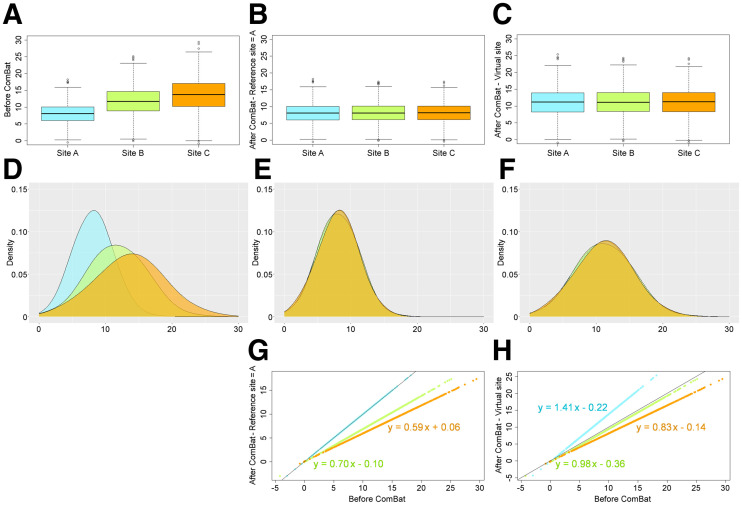
FIGURE 1.
Box plot and feature value distributions for experiment 1 (Table 1). (A and D) Plots before ComBat. (B, E, and G) Plots after ComBat by aligning data from sites B and C to site A. (C, F, and H) Plots after ComBat by aligning data on virtual site (intermediate between 3 sites). Bottom graphs show equations of transformations.

