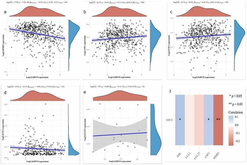
Figure 4.

Correlation analysis in TCGA dataset. (a) MMP3. (b) AXL. (c) MCSF. (d) I309. (e) CTACK. The X axis represents the expression distribution of GDF15, and the Y axis ordinate represents the expression distribution of MMP3, AXL, MCSF (CSF), I309 and CTACK, respectively. The density curve on the upper side is the distribution trend of GDF15, and the density curve on the right represents the distribution trend of MMP3, AXL, MCSF (CSF), I309 (CCL1) and CTACK (CCL27), respectively. (f) Correlation analysis between each gene and GDF15. Red represents a positive correlation, blue represents a negative correlation, the darker the color is, the stronger the correlation between the two, *P < 0.05, **P < 0.01
