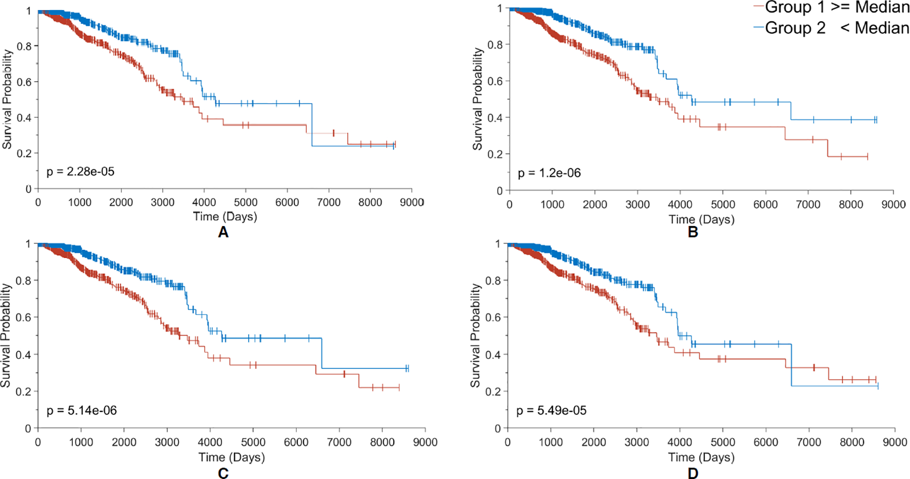
Figure 4.

Kaplan Meier plots for the 4 most contributing nodes (A-D) to the RS score in the Surv_GCNN model. (A) KM plot based on node 136, the biggest contributing node; (B) KM plot based on node 131 the second-biggest contributor; (C) KM plot based on node 134 which is the third-biggest; and (D) KM plot for the 4th-biggest contributor node 58. The groups in each KM plot were divided by their median node value from all 1080 patients. Larger than the median is shown in the red group and less than the median in the blue group. The log-rank p-value was also shown in the bottom corner of the graph.
