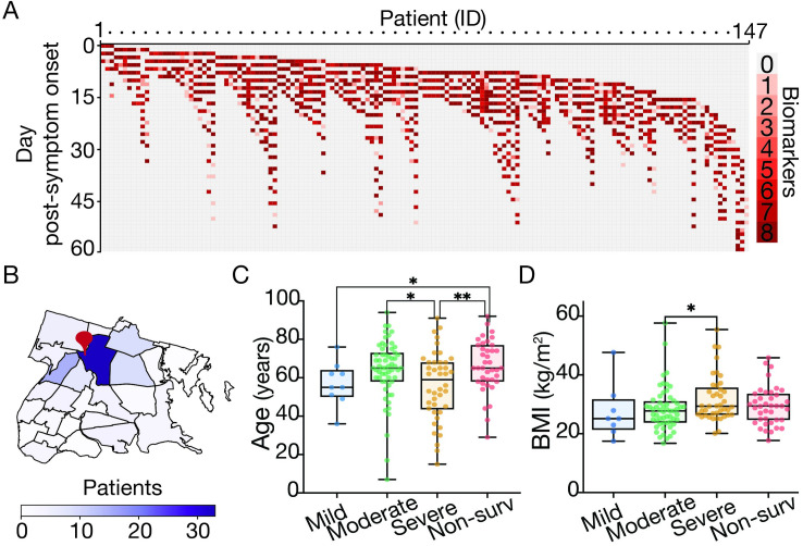
Fig 1. Overview of patient cohort by sampling strategy, residence and demographic associations with COVID-19 disease severity.
(A) Heatmap describing the number of biomarkers (y-axis; up to eight different biomarkers, see materials and methods) measured for any given patient (x-axis; described by an internal identifier) and day PSO over course of hospitalization (patients = 147, blood samples analyzed = 1,954). (B) Choropleth map of the Bronx zip codes colored by the number of patients enrolled in the study. The red pin denotes the location of Montefiore Medical Center. (C-D) Box plot of patient’s age (C) and Body Mass Index (D) by oxygen supplementation or non-survival outcome (Blue: Mild, green: moderate, orange: severe, red: non-survival). Boxes extend from the 25th to 75th percentiles, the whiskers represent the minimum and maximum values and the middle line corresponds to the median. Statistical significance is denoted with asterisks (Mann-Whitney; *p < 0.05, **p < 0.01). We define “day post-symptom onset” (PSO) as the day relative to the patient-reported onset of symptoms. We downloaded the raw data to make the map from NYC Open Data (https://data.cityofnewyork.us/City-Government/Borough-Boundaries/tqmj-j8zm) and plotted it using pandas and geopands.

