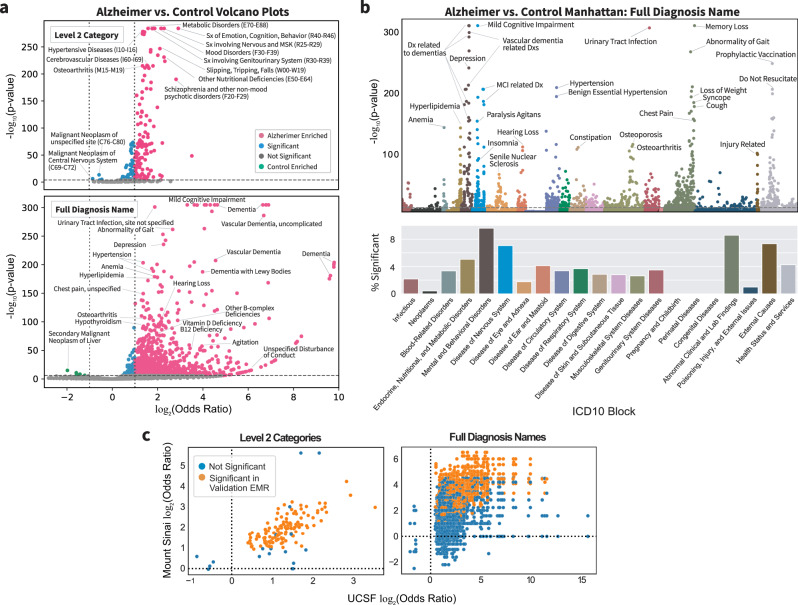
Fig. 4. Comorbidity enrichment analysis identifies enriched diagnosis in AD vs. control cohorts.
a Volcano plot for Level 2 categories (top) and full diagnosis names (bottom) compared between AD and control cohorts using two-sided Fisher’s exact or Chi-squared test. p-value cutoff is Bonferroni-corrected (p-value < 2e−8 and 1e−6) with log2 odds ratio cutoff of 1 for AD-enriched (pink) or log2 odds ratio cutoff of −1 for control-enriched (green) and remaining significant diagnoses in blue. Some of the top significant diagnoses are labeled. b Top, a Manhattan plot with full diagnosis names colored by ICD-10-CM categories with significance determined by two-sided Fisher’s exact or Chi-squared test with Bonferroni-corrected p-value threshold of 0.05. Some of the top diagnoses in each category are labeled. Bottom, the percentage of diagnosis in each ICD-10-CM category is significant. c Diagnosis AD vs. control odds ratio correlation plots between UCSF and Mount Sinai for Level 2 diagnosis categories and full diagnosis names that are significant at UCSF (two-sided Fisher’s exact or Chi-squared test, Bonferroni-corrected p-value threshold of 0.05). Each dot represents a category or diagnosis, and dots in orange are significant at Mount Sinai with (two-sided Fisher’s exact or Chi-squared test with Bonferroni-corrected p-value threshold of 0.05 based on the number of significant UCSF diagnoses).

