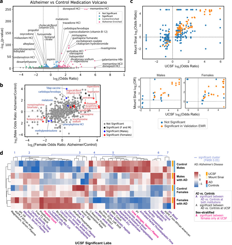
Fig. 6. Medication and lab analysis shows medication enrichments and median lab value differences between AD and control cohorts.
a Volcano plot for generic medication names compared between AD and control cohorts using two-sided Fisher’s exact or Chi-squared test. p-value cutoff is Bonferroni-corrected (p-value < 2e−5) with odds ratio cutoff at 2 for AD-enriched (pink) or 1/2 for control-enriched (green). Remaining significant diagnoses are in blue. b Log–log plot of generic medication names compared between AD and control cohorts within each sex. The log of the odds ratio for each sex is plotted on the axis, with points colored by significance based upon two-sided Fisher’s exact or Chi-squared test with Bonferroni-corrected threshold of 0.05 if female-only (red), male-only (blue), or both (black). c AD vs control (top) and sex-specific (bottom) odds ratio correlation plots between UCSF and Mount Sinai for medications significant at UCSF (two-sided Fisher’s exact or Chi-squared test with Bonferroni-corrected p-value threshold of 0.05). Each dot represents a medication, and the dots in orange are significant at Mount Sinai (two-sided Fisher’s exact or Chi-squared test with Bonferroni-corrected p-value threshold of 0.05 based on the number of significant UCSF diagnoses in each group). d Heatmap of lab values filtered on significance at UCSF in AD vs control comparison across sex-specific groups at UCSF and Mount Sinai. Labs are clustered with light blue lines representing significant cluster breaks (family-wise error rate (FWER)-corrected p-value 0.05). Text color represents significant labs at both institutions (purple), significant among females only at UCSF (red), or significant between AD vs controls at UCSF only (black). Heatmap colors represent z-score of the average median value across the 4 groups at each institution.

