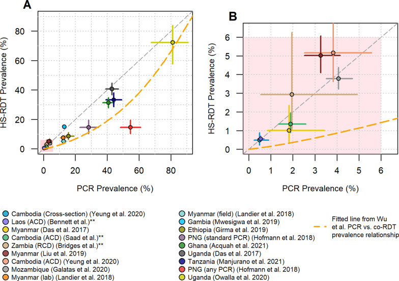
Fig. 3.
Comparison of PCR prevalence against HS-RDT prevalence. A shows all data used in this analysis (n = 18), and B shows a zoom-in of the samples with prevalence below 6%. The horizontal and vertical lines from each data point show the binomial confidence intervals associated with the PCR prevalence and HS-RDT prevalence estimates, respectively. The orange dashed line shows the fitted relationship derived from a previous meta-analysis of PCR and co-RDT prevalence surveys [3]. The grey diagonal line shows the x = y equivalence line between the HS-RDT and PCR. Additional details are provided on the sample type where necessary. **Unpublished studies. PNG Papua New Guinea, RCD reactive case detection, ACD active case detection

