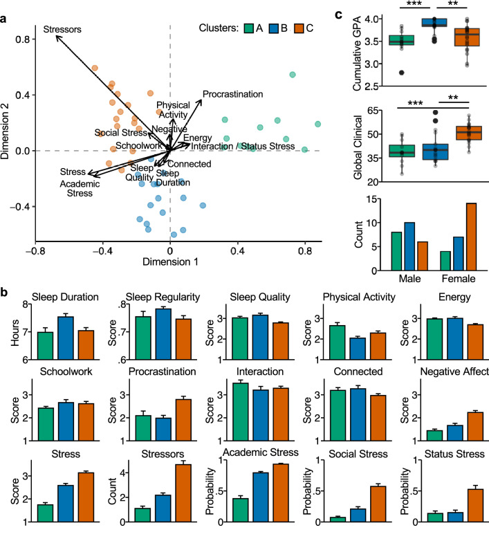
Figure 5.
Clustering analysis reveals three distinct student profiles. (a) Biplot shows both the maximal separation among the clusters, displayed as dots colored by cluster, and the original variables used in the analysis, shown as standardized basis vectors on the two dimensions. The length of the vectors represents standardized regression coefficients. The arrows for Interaction and Status Stress are almost fully overlapping, and the vector for Sleep Regularity is almost exactly at (0, 0). (b) Bar plots show between-person means of each clustering variable separately by cluster. Error bars represent standard errors of the mean. (c) Boxplots show participants’ cumulative grade point average (GPA) their first year of university (top) and mean Global Clinical symptom severity (middle). Asterisks represent statistically significant differences between cluster pairs (two-tailed t-tests; **p < 0.01, ***p < 0.001). Bottom bar plot shows the self-reported sex breakdown of the three clusters.

