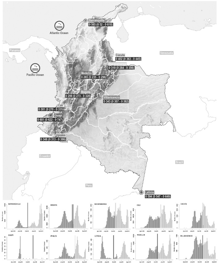
Figure. 1.
Map of study locations and epidemiological curves.
Map of Colombia showing the locations of the 10 cities where the serosurveys were conducted. Panels surrounding the map show the epidemic curves at each city (weekly number of reported cases). The colored lines and polygons (red, orange, blue, yellow, green, cyan, purple, lilac and light yellow) indicate the period of sample collection for each city relative to the ongoing epidemic.

